Russian and English
Switch languages without losing the current section or open project.
Architecture studio website and portfolio
A bilingual architecture studio website with project galleries, services, and educational programs.
[ Open live product ]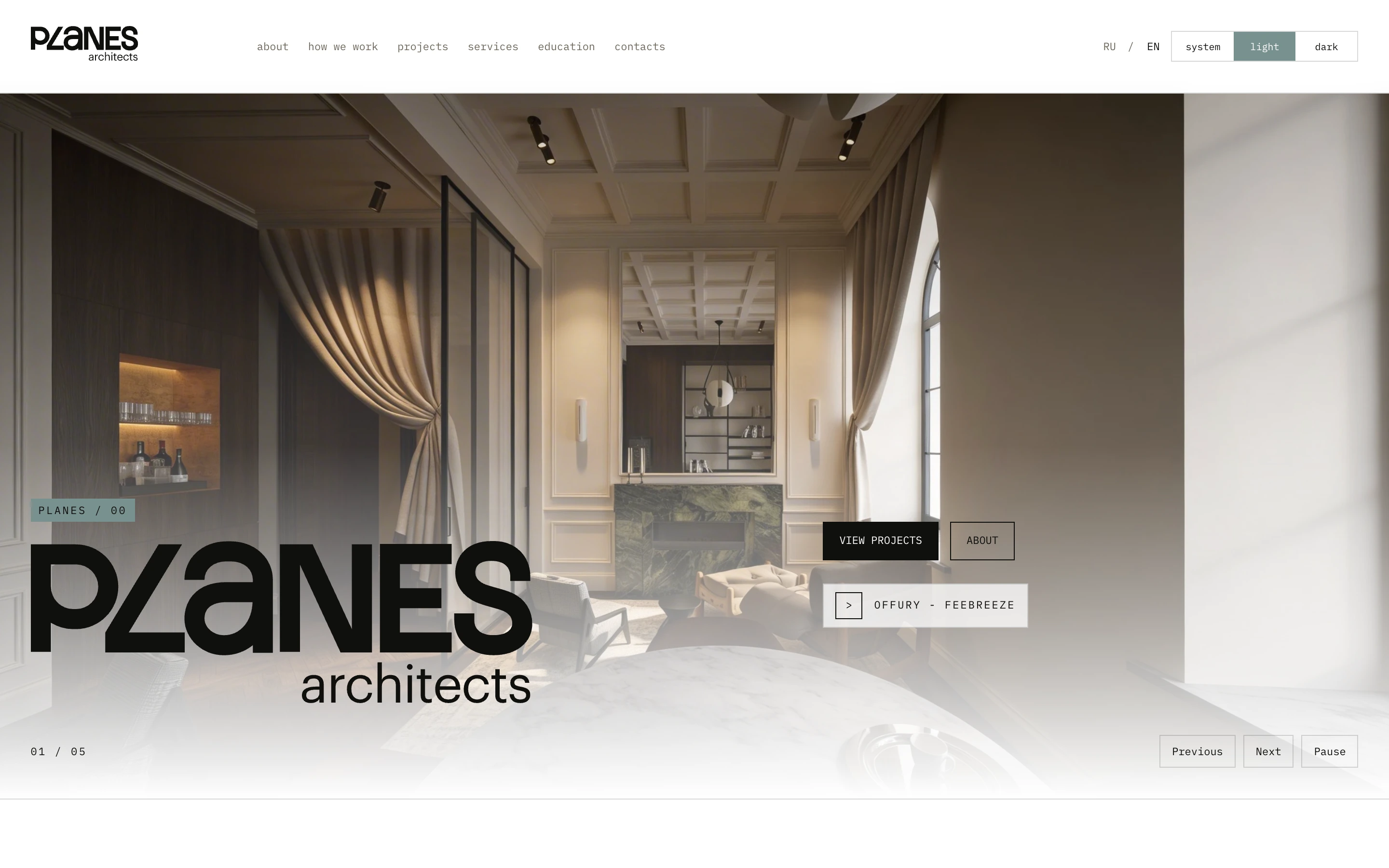
// 01The website in numbers
// 02Context
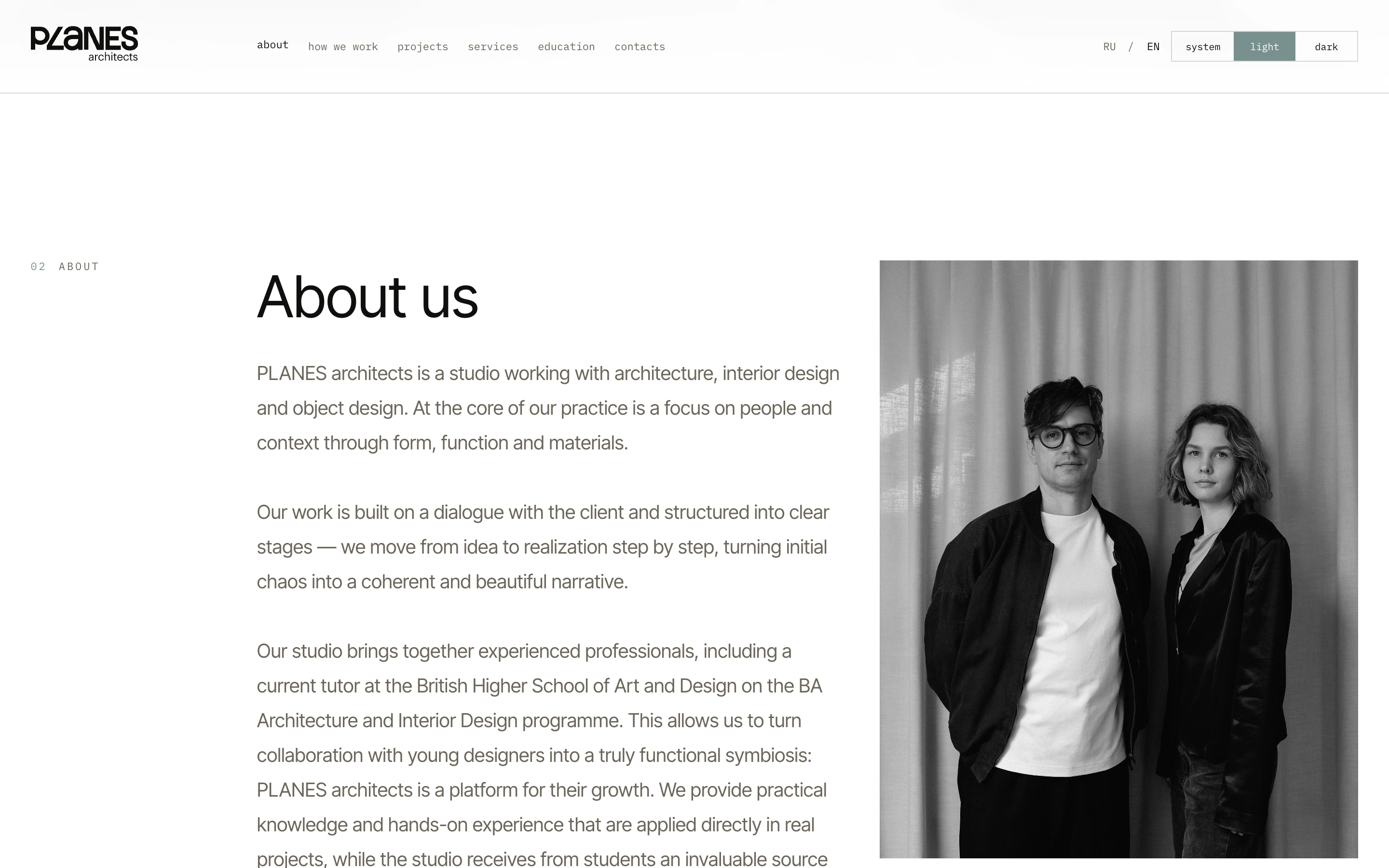
The PLANES architects website puts the studio's work first. Visitors can explore architecture and interior projects, learn about the team's services and process, join an educational program, or send an enquiry.
The website introduces the studio to future clients and gives architects and designers a way to discover Bootcamp by PLANES.
// 03Problem
The goal was to bring the studio's calm editorial style to the browser without taking attention away from the project photography. The team also needed a simple way to add work, translate copy, and update large galleries without a developer.
The interface is built around photography and restrained typography. There are no unnecessary decorative layers: navigation stays compact, captions do not compete with the images, and transitions make it easy to move through sections and projects.
The main constraints were the weight of project galleries, the different lengths of Russian and English copy, and the need to preserve a balanced layout on phones, tablets, and wide screens.
IMAGERY / TYPE / CONTENT / SPEED
// 04Portfolio
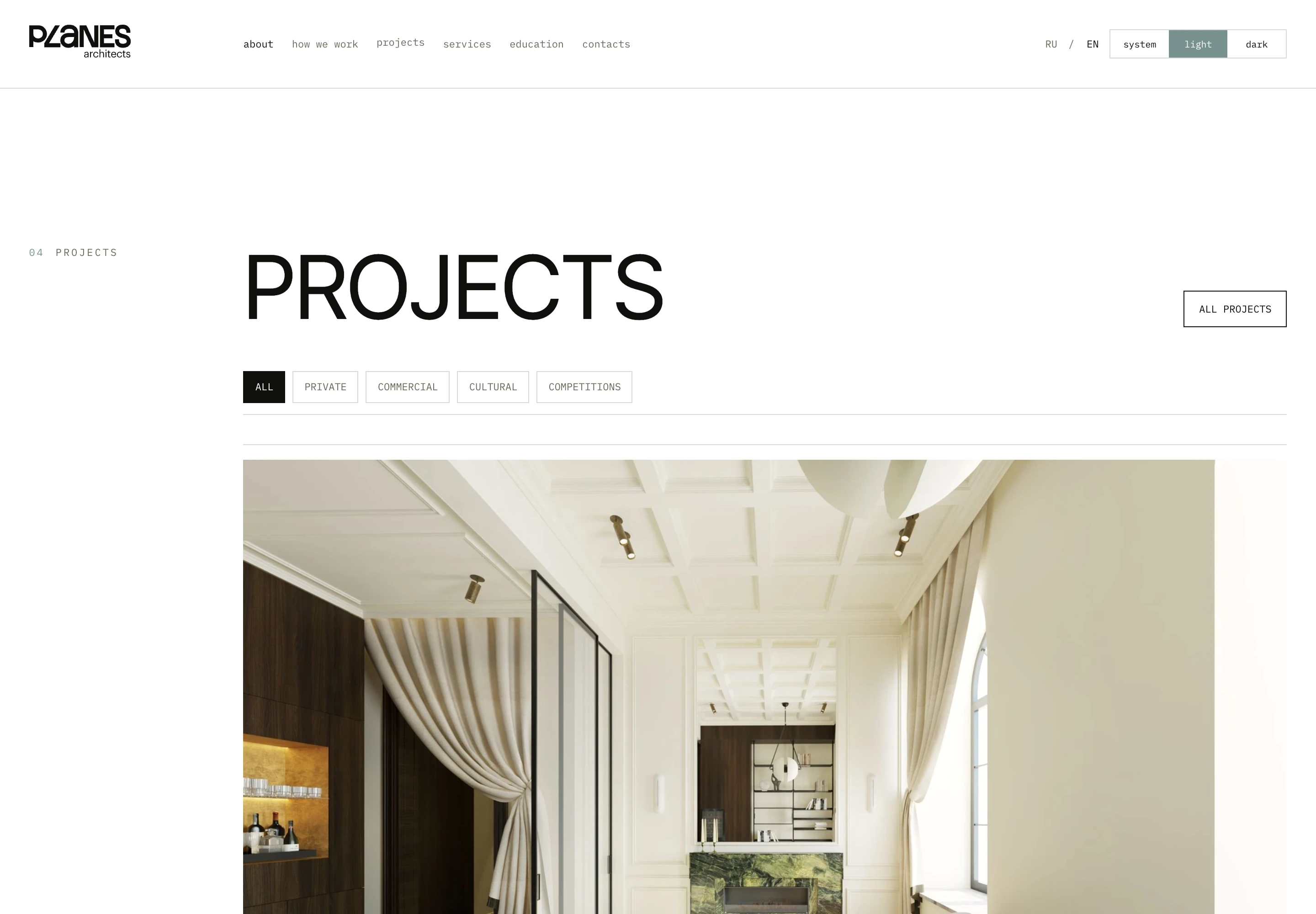
Work is grouped into private, commercial, cultural, and competition projects. Filters narrow the list quickly, while each project pairs its gallery with clear details about the space.
// 05Content
Editors enter a project once, adding its description, details, and gallery before linking the Russian and English versions. Nuxt receives that content and turns it into the finished page.
Nuxt renders the pages, routes, and language versions. The studio manages projects, copy, and photography in Strapi, while PostgreSQL stores the content structure. Images are delivered separately at a suitable size for each screen.
Switch languages without losing the current section or open project.
Follow the device setting or choose the light or dark theme manually.
New projects and articles are added through Strapi, without rebuilding the interface by hand.
Photography remains the main content and loads at a size suited to each device.
// 06Display
System mode follows the device setting. Light mode keeps the feel of a printed architecture journal, while dark mode makes project photography more comfortable to browse at night.
// 07Mobile
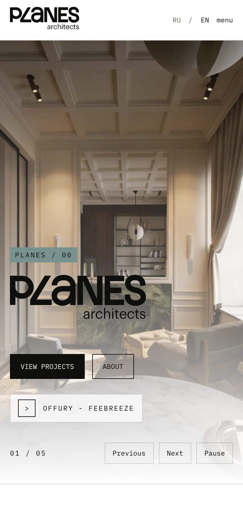
Navigation becomes shorter, actions remain within reach, and large images adapt to the portrait screen without tiny text or horizontal scrolling.
// 08Result
PLANES architects now has a working bilingual website for projects, services, Bootcamp, and enquiries. The team can update it through the CMS, while visitors can browse the work on any device and in the theme they prefer.
// My role
I handled the frontend architecture and responsive build, connected Strapi, localization, filters, galleries, and display themes, and prepared the website for production.
Stack[]
root@portfolio:~/contact$ ./start-conversation // Contact me directly
/* Send me a short note about what you want to build and how I can help. That is enough to get started. */